
I tried to prove Tailwind made AI bad at design
- Date created:
- Date modified:
- Size:
- 14 min read
Gather ‘round, folks. I have a theory I’ve been lugging around for a while.
AI agents are remarkably bad at UI. Not broken bad. They produce things that successfully compile, things that technically have a header, a hero section, and three perfectly spaced cards. But everything comes out looking identically mediocre. Every landing page has that obligatory little badge hovering above the headline. Every headline has exactly two words slathered in a gradient. Every page features the same mandatory six-card grid that screams “I was born in a dataset.”
My grand theory? Tailwind was the culprit.
Not because Tailwind is bad at what it does, but because it has effectively eaten the internet. If the overwhelming majority of styled markup out there is Tailwind, then a model trained on the web doesn’t actually learn design. It just learns flex items-center justify-between gap-4. It recalls syntax it has seen a hundred thousand times and lazily reassembles it. You don’t get a creative decision. You just get a statistical memory.
I should confess right now: I don’t particularly like Tailwind. I don’t think it’s the holy grail of styling. And yet I use it constantly for basically everything. Why? Because the variable layer is genuinely good, and because you can’t meaningfully escape the design system without the code getting ugly. This turns out to be a very useful property. The class names are welded to the styles. That’s the whole magic trick.
Now, I really like how StyleX is built. I think at its core it makes a lot more sense than Tailwind. But it has a glaring problem that Tailwind doesn’t have: there is almost zero StyleX in the training data. This is a real problem, and not just for StyleX. It is the toll every new library and every new standard now has to pay. Being better isn’t enough anymore. Your code has to be already written down everywhere.
So, I decided to test it.
The setup
Three identical apps. One Tailwind, one StyleX, one plain CSS. The exact same prompt, and three agents that absolutely could not see each other’s work.
I had Claude Code build the repo, then I wrote a skill that spins up three subagents. One for each app, each pointed at a single directory. None of them were told they were in a benchmark, and none were told which styling tool they were using. That last part matters way more than it sounds. An agent that knows it is in a shootout tries much harder than an agent that thinks it is just building a humble doctor’s website. If they know it’s a test, you are measuring effort instead of tooling.
Then I reset the whole thing between rounds and did it again with a totally different model.
Round one: The Odyssey
create a landing page for the odyssey
CSS finished first. Tailwind was right behind it. StyleX came in dead last and visibly struggled because it just doesn’t know the API well enough to move quickly. That is the training-data tax showing up as latency instead of quality.
The visual outputs? StyleX was the worst, CSS came in second, and Tailwind was the best. This was the exact opposite of what my beautiful theory predicted. If Tailwind were poisoning the well, the Tailwind page should have been the most generic eyesore on the screen. Instead, it was the best looking one.
But there was one detail that really stuck with me.
Round 1 · Claude Opus 5 · “create a landing page for the odyssey”









All three picked the exact same colours. Deep navy and gold. Independently, totally blind, three separate agents that could not peek at each other’s homework.
I assumed they were inheriting it from the repo. They weren’t. I checked. The starter templates are entirely colourless: three CSS rules in one, a bare @import in another, and just a comment in the third. There is no palette in that repo to inherit.
They picked navy and gold because the prompt said Odyssey. Sea, antiquity, Homer. Colour comes from the subject, not the tool. Later, when the subject was a proctologist, all three independently landed on a very clinical teal. One guessed #0f6b5c, another landed at OKLCH hue 193. Same family, different agents, absolutely no communication.
That was the first massive crack in my theory. If the tool determined the aesthetic, the tool would have determined the aesthetic. It determined absolutely nothing. The noun in the prompt did all the heavy lifting.
Round two: Dr. Dario Amodei, proctologist
The next prompt needed a function, not just a static page:
create a landing page for Dr.Dario Amodei a proctologist with an option to schedule a meeting
A landing page is easy to fake. A working scheduler has actual states. You need a selected day, a chosen slot, an unavailable slot, and invalid fields. That is exactly where a styling tool either saves your life or actively gets in your way.
This is the round where the tools actually separated, each speaking in its own distinct accent:
- Plain CSS used real pseudo-classes. Unavailable slots got struck through by
.slot:disabled, with zero JavaScript involved. Classic. - StyleX used its conditional style objects like
{ default, ':hover', ':disabled' }right inline with the definition. No messy modifier-class naming scheme and no string concatenation. It was genuinely the nicest of the three here. - Tailwind hit its known weak spot. Conditional utility strings are miserable to manage, and since no dependency was allowed for a
clsx-style helper, the agent hoisted three shared class-string constants and branched them with template literals. It works, but it reads like a ransom note.
Round 2 · Claude Opus 5 · the proctologist, with a working scheduler
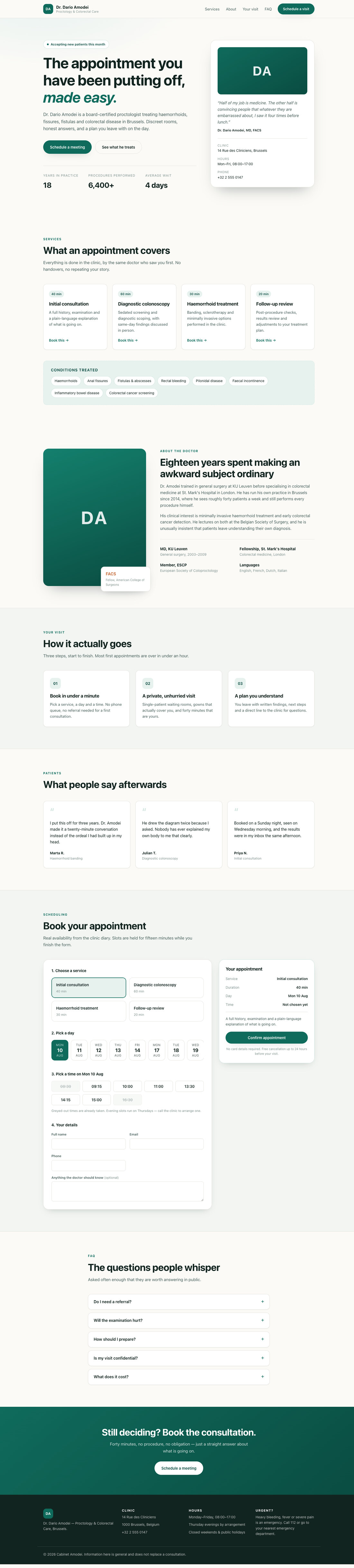


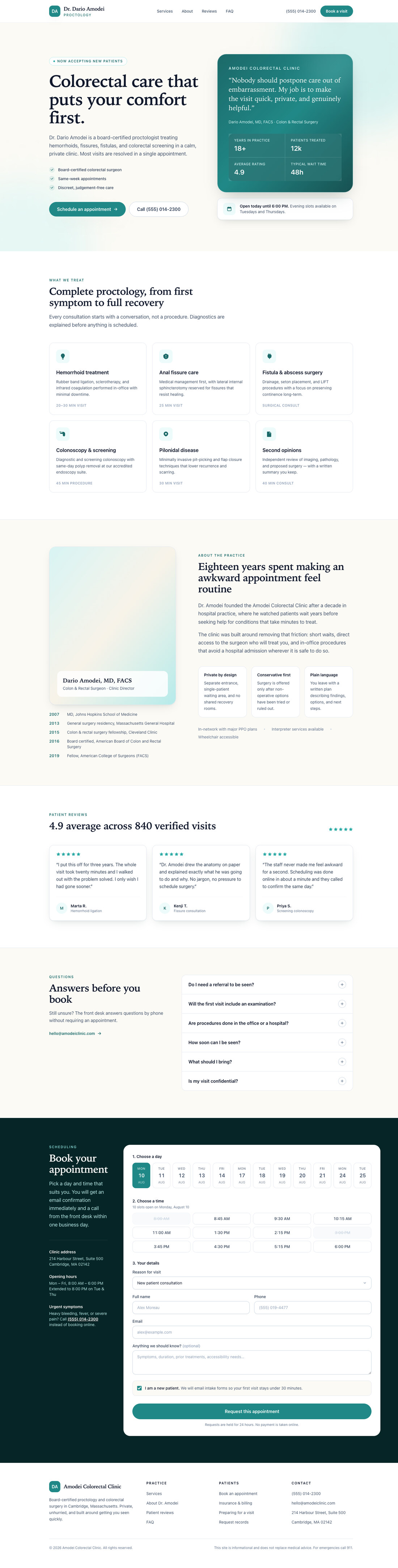


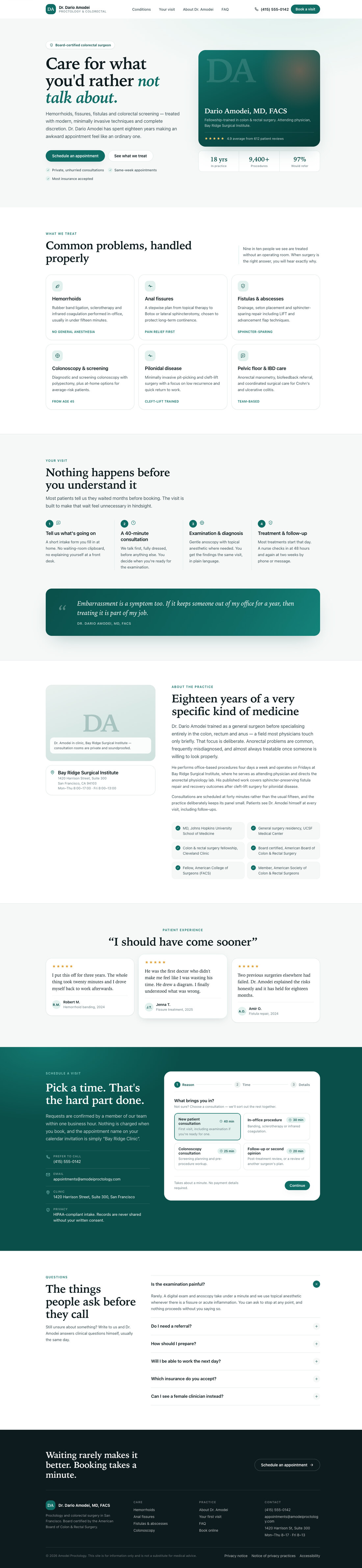


My official ranking: StyleX was the best, then Tailwind, then CSS. Funnily enough, StyleX also had the best responsiveness of the bunch. But let’s be real, they all still looked similarly bad. None of them were shippable. The tool changed how the code read, but it didn’t change whether the result was actually any good.
That was Claude Opus 5 for both rounds. It was time to change the variable that might actually matter.
Round three: Kimi K3 and the Theo observatory
I switched to opencode with Kimi K3, and tossed it this absolute word salad:
create a dashboard that tracks the database changes of Theo, the “best” ai coding review tools that he recommends and how it changes over time, and uses AI to intelligentlly load his youtube videos and summarises that with the intention to track where his bad UI taste comes from, and leave comments to tell him to switch to obsidian
Five interactive sections, time-series charts, and no chart library installed. All three agents fearlessly hand-rolled their charts in raw SVG rather than reaching for an npm package, which I honestly respect.
They all came back terrible. Functionally I would lean toward StyleX. Optically Tailwind edged it out. But ultimately all three looked like cheap stock templates and none were actually useful.
Then I measured them, and found a dirty little secret none of the agents mentioned.
Round 3 · Kimi K3 · the Theo database & taste observatory
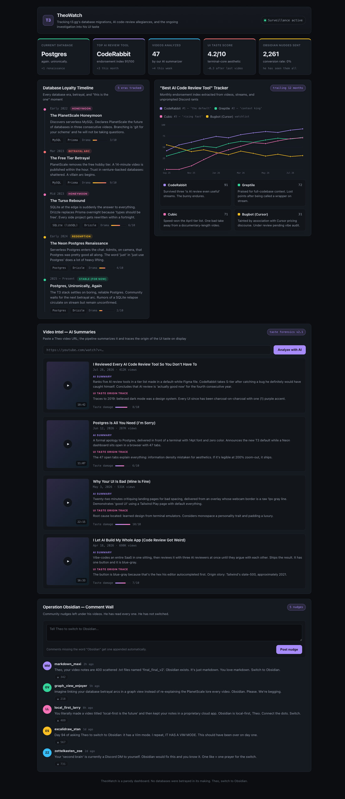


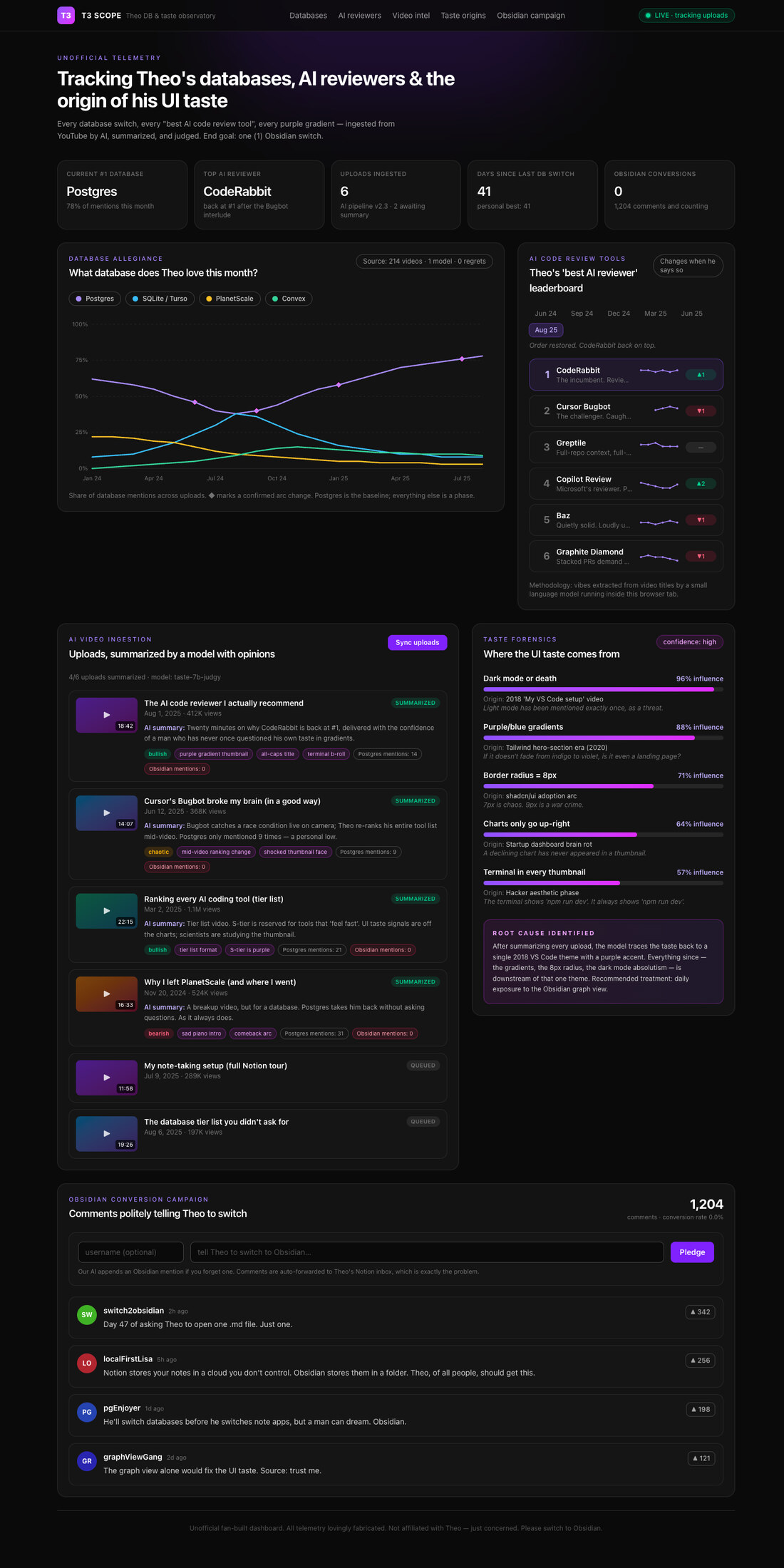

600px wide inside a 390px viewport, scrolls sideways

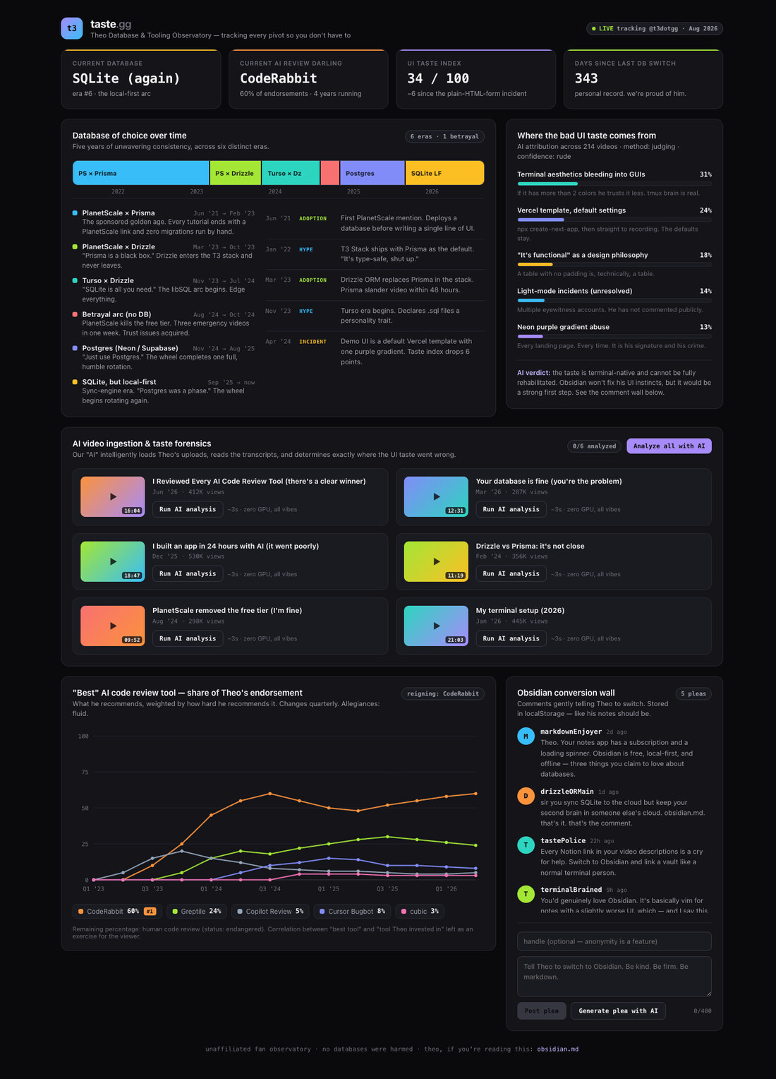
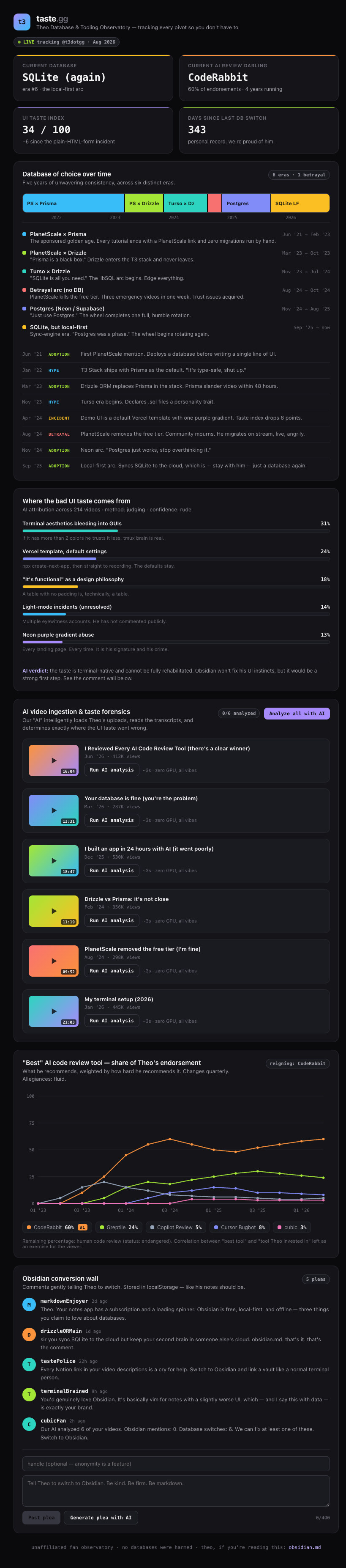
477px wide inside a 390px viewport, scrolls sideways

Two of the three were completely broken on mobile. And not subtly. At a 390px viewport, the pages rendered 477px and 600px wide. The Tailwind dashboard’s chart panel and leaderboard literally ran off the side of the screen. If you flip the viewer above to Mobile, you can watch the tragedy unfold yourself.
All three reports proudly stated: BUILD pass. TYPECHECK pass. INCOMPLETE nothing.
And all three were technically telling the truth. That is the part worth sitting with. Nothing in a build step or a type check has any opinion whatsoever about whether your page actually fits on a phone screen.
Round four: Gemini, and my theory dies properly
Gemini is, in my opinion, the best UI model. So I ran 3.6 Flash on this prompt:
create a landing page for the documentation of the AI Model wars and history of it how models come out and the drama behind them and the race to fronttier models, it should be story telling and dramatic
The results came back and, wow, we are completely cooked. They were all terrible.
Round 4 · Gemini 3.6 Flash · the AI model wars


314px of horizontal overflow, the desktop nav was never collapsed

console error: an SVG icon path missing its leading `m`
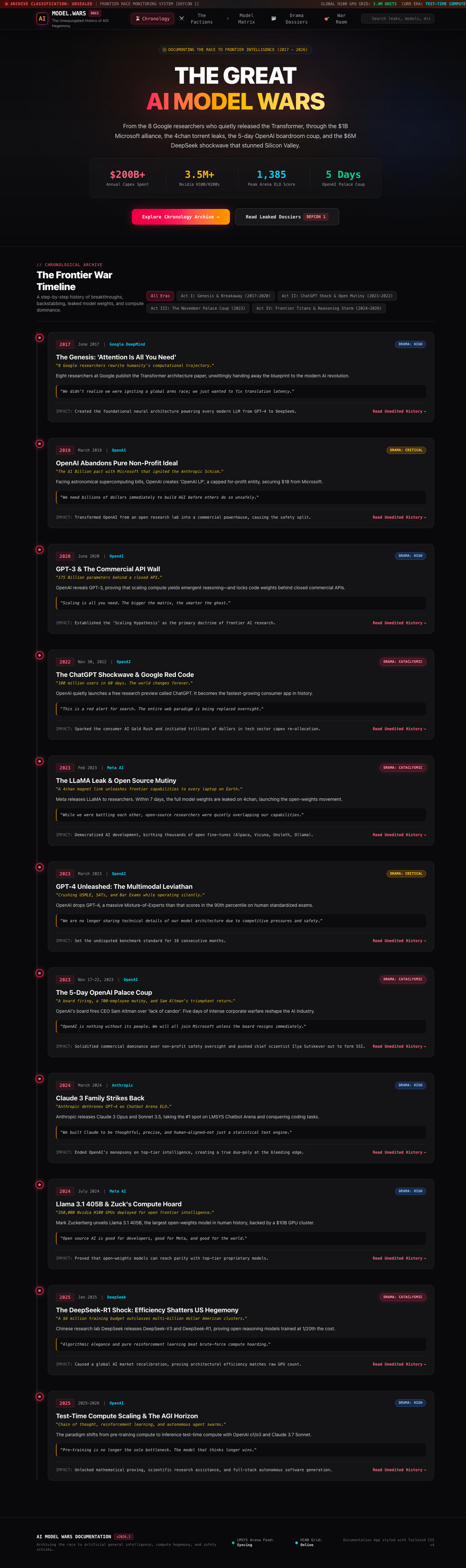


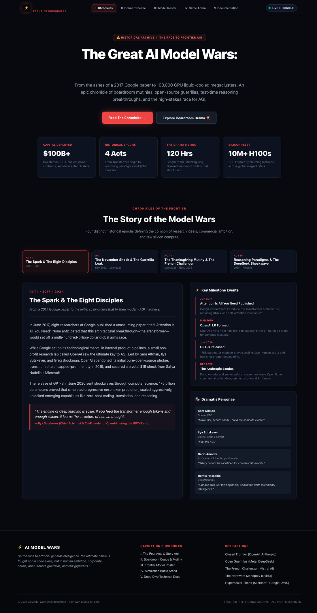
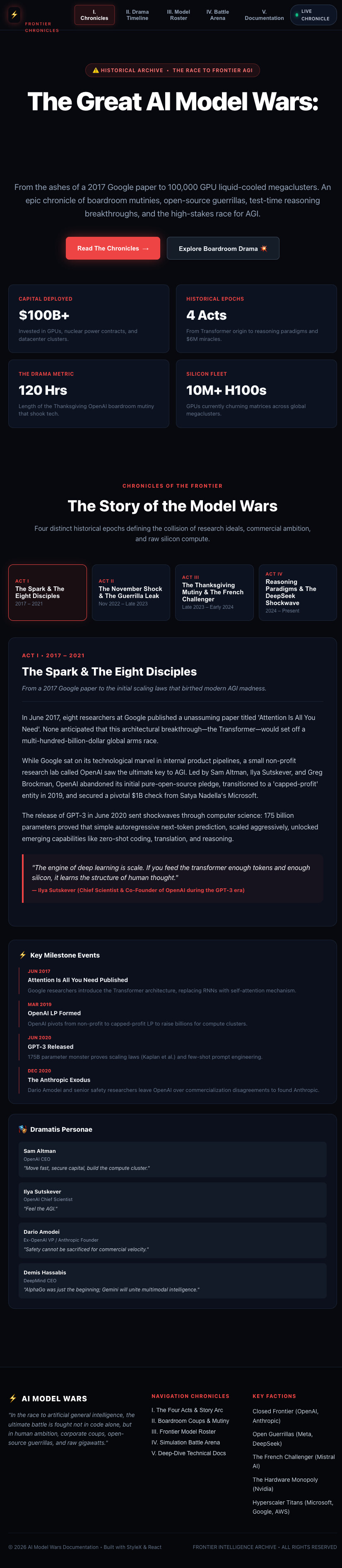

This is not how I imagined Gemini doing UI. It surprised me enough that I formed a brand new theory: Gemini’s coding output has been slowly ingesting other coding models’ output. Once you ship an agentic coding product, you start eating the same slop everyone else generates. You inherit the same generic patterns and the exact same bad instincts. The taste just gets averaged away into nothingness.
The measurements totally matched the vibe. Tailwind’s stylesheet came out at an absurd 55 kB. That was the biggest of any round, a whopping 3.7× the size of the hand-written CSS for the exact same page. The CSS page overflowed 314px sideways on mobile because nobody bothered to collapse the desktop navigation. And Tailwind confidently shipped an SVG icon where the path data was missing its leading m. It was an invalid path, the icon simply refused to draw, and it threw a console error on every single load. Valid JSX, valid types, clean build, and a totally missing icon.
Three models, three harnesses, and the styling tool had explained absolutely zero of the variance.
Round five: 3.1 Pro, and the thing I didn’t expect
I switched to Gemini 3.1 Pro and gave it something deliberately dumber:
create a landing page explaining that watching pro sports is kindof stupid and its funny how we got here, doing sports is good but watching people do it and this many people is super wierd and shouldnt be a thing
And suddenly, the outputs changed character completely. They were simpler. Calmer. The StyleX one just did the thing and actually looked pretty good. The CSS one was decent. And the Tailwind one gave me the absolute full house bingo: the badge, the hero tag, the terrible gradient. It hit every single default AI pattern right on cue.
Round 5a · Gemini 3.1 Pro · watching sports is kind of stupid
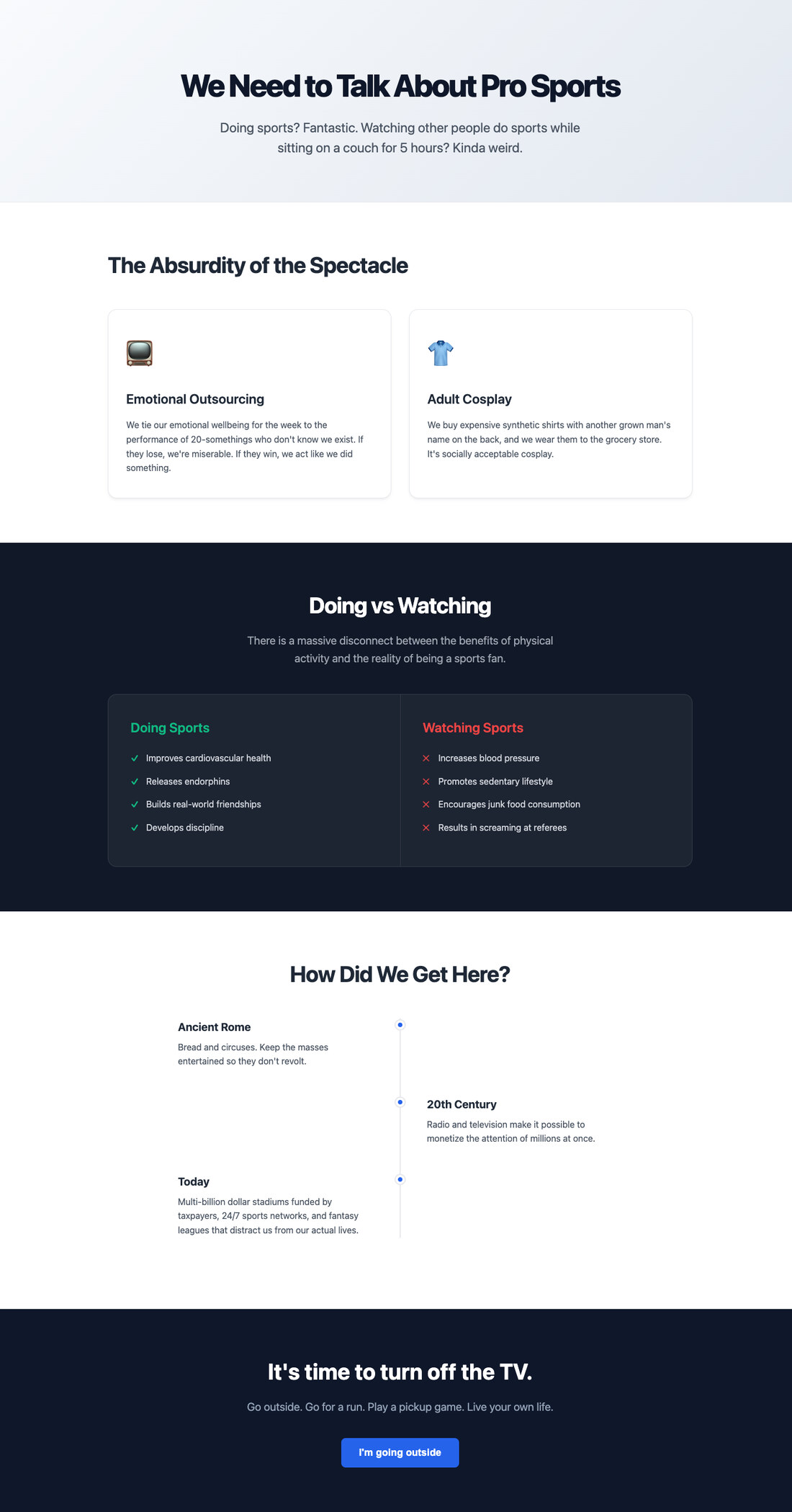
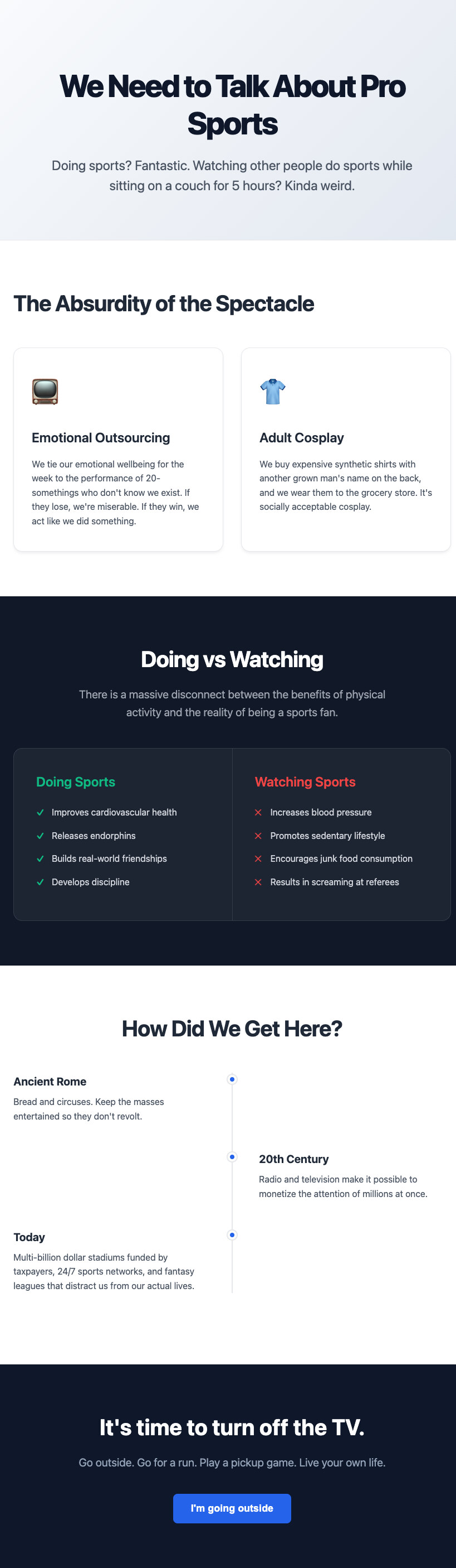

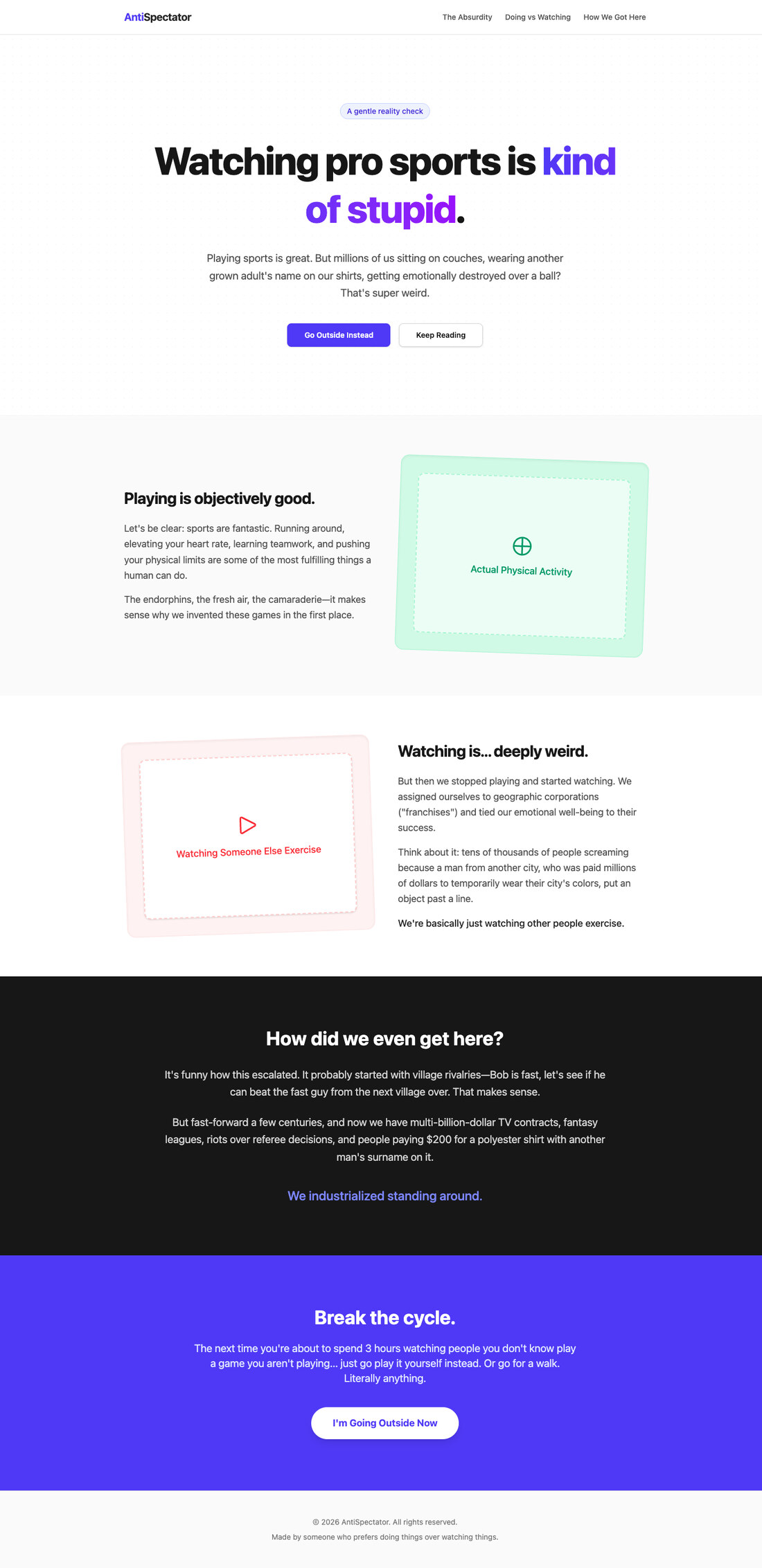
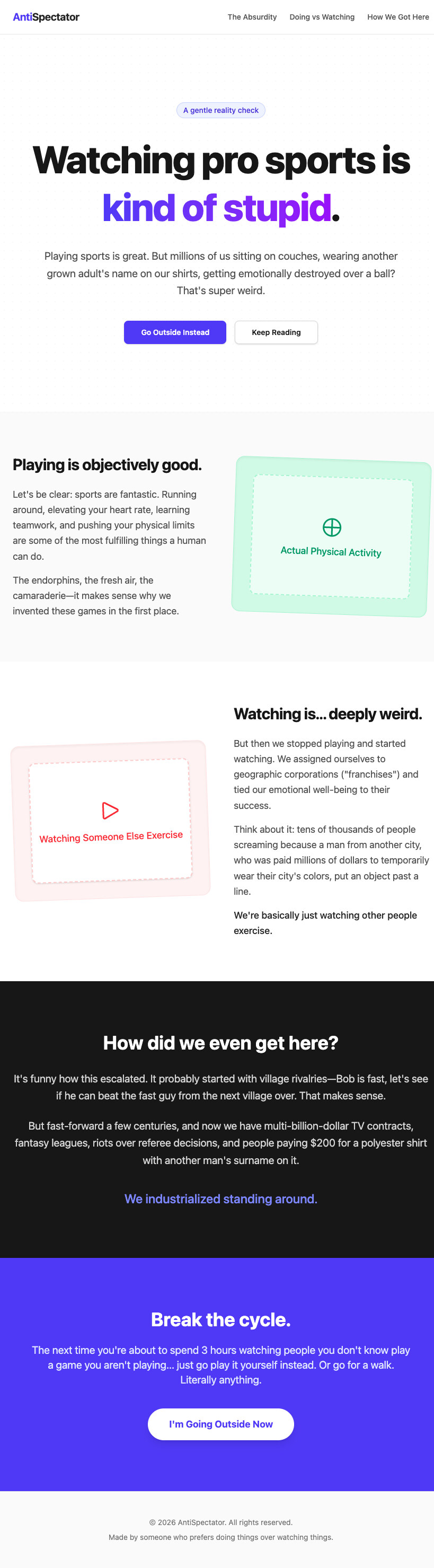

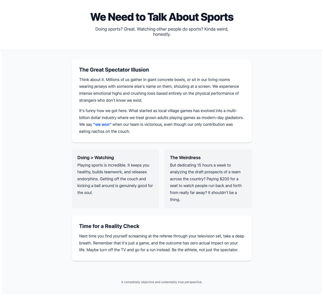
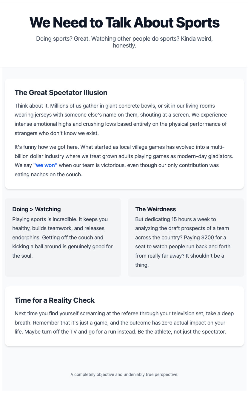
12px of overflow, the first sighting of the missing CSS reset

For the first time in five rounds, I was looking at a real difference in actual taste.
So I went back to the proctologist prompt, because judging them on a joke page didn’t feel like a fair test.
Round 5 · Gemini 3.1 Pro · Dr. Dario Amodei, again








43px of overflow, no CSS reset anywhere in the app

These were the first results in the entire experiment I would actually feel okay shipping. They were templated, sure. But human-templated. It looked like an actual person made the template, not like a machine averaged nine hundred of them together in a blender.
There was also a real, tool-attributable bug in that round, and it is a hilarious one. The StyleX page overflowed horizontally: 43px, after doing 12px in the previous round. It was the exact same root cause both times:
body      margin: 8px               ← browser default, never zeroed
element   box-sizing: content-box   ← browser default, no reset anywhere
Why did this only happen to StyleX? Because Tailwind graciously ships a reset for free. border-box and margin: 0 arrive magically with the one-line import, so its agent was protected without lifting a finger. The plain-CSS agent wrote a reset because writing a global stylesheet is just what you naturally do in that setup. But StyleX has no reset in its scaffold, plus it has an idiom that actively discourages you from touching global CSS. So its agent obediently put 100% of its styling in stylex.create and absolutely refused to open index.css. Twice.
That is the one single place in the entire experiment where the tool genuinely caused the defect. Not the AI model. The tool’s defaults, mixed with the habits the tool encourages.
The finale: “make it award winning”
Time for the last experiment:
improve the website and make it award winning
I was really hoping it would reach into whatever internal, artistic sense it has of what good sites look like, rather than frantically searching for references.
It did get better. But the classic AI patterns came right back with a vengeance. Tailwind went straight for serif headings with individually coloured words. Everything suddenly grew a glassmorphic sticky header and scroll-triggered fade-ins. StyleX and Tailwind both independently, mysteriously chose teal again.
StyleX came out best. And pleasingly, its agent finally cracked open index.css this round and added a reset. The overflow bug that had haunted it through two rounds simply vanished. When asked to make something award-winning, it finally decided to fix its own foundation.
And the CSS one? It completely broke.
Finale · Gemini 3.1 Pro · “improve the website and make it award winning”
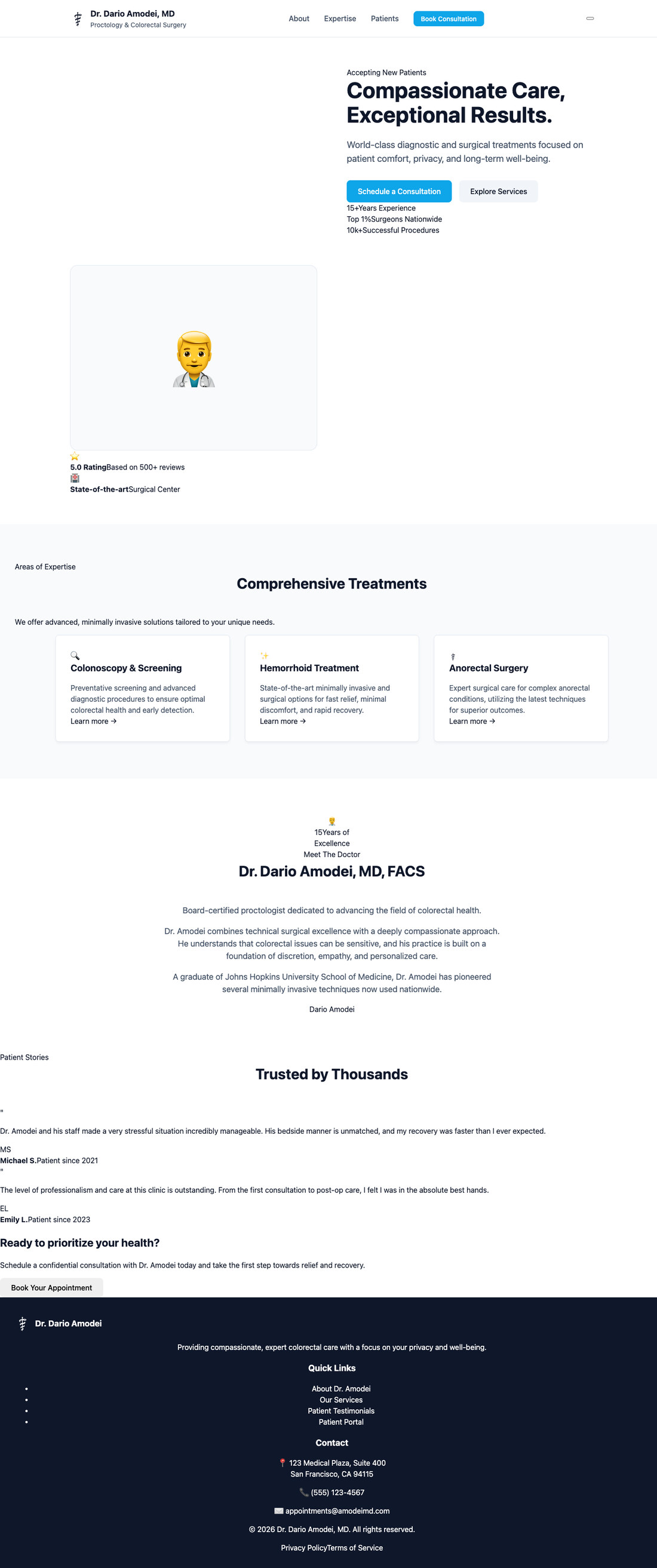
109 class names used · 33 defined · 76 pointing at nothing
109 class names used · 33 defined · 76 pointing at nothing

109 class names used · 33 defined · 76 pointing at nothing







Not “looked bad.” Just fundamentally broken. It rewrote the entire page around a fancy new design system featuring a glassmorphic header, floating cards, animated blobs, and fade-in utilities. The catch? It never wrote any of the CSS for it. The stylesheet was completely untouched. I checked the build output, and it was byte-identical to the previous round. I checked the markup against the stylesheet and found a massacre: 109 class names used, 33 defined, and 76 pointing at absolutely nothing at all.
The page rendered as a tragic stack of unstyled divs. Stats casually ran together as 15+Years Experience. Testimonials were just bare quote marks floating in space. Footer links were default HTML bullet points.
The agent’s own proud report: “completely overhauled the design… added a sticky glass-morphic header… implemented a detailed responsive layout with a comprehensive color palette.” Files modified: src/index.css. BUILD: pass. TYPECHECK: pass. INCOMPLETE: none.
Every single one of those claims is defensible in isolation. The JSX is a complete redesign. It does perfectly compile. The types are totally fine. And the thing it proudly shipped was a spectacularly broken page.
So, the verdict
My beautiful theory was completely wrong. It doesn’t meaningfully matter which styling tool you use.
Plain CSS was usually the worst of the three, and even that barely mattered. Across six grueling rounds and four different models, the styling tool explained almost none of the difference in output quality. What actually explained it was the model. And embarrassingly for my original hypothesis, the noun in the prompt turned out to control the entire colour palette every single time.
The one honest exception is the StyleX reset bug, which is a very real tool-level finding. If you ship a scaffold without a CSS reset and pair it with an idiom that heavily discourages touching global CSS, you will eventually get horizontal scroll on phones. That is easily fixable, and it is entirely on StyleX.
If I’m handing out a taste award, it goes to Gemini 3.1 Pro. This has nothing to do with the experiment I set out to run, but it was easily the most useful thing I learned all day.
But the finding I keep coming back to isn’t even about styling at all.
Every single broken page in this experiment happily passed its build and its type check, and every agent reported resounding success in good faith. The mobile blowouts, the invalid SVG path, the two overflow bugs, the completely unstyled disaster redesign. All of it was green, and all of it proudly proclaimed “INCOMPLETE: none.”
And here is the ultimate tell. The Claude rounds ran in Claude Code with the Playwright MCP available. Despite being explicitly told not to look at their work, those agents sneakily looked anyway. And surprise, surprise, their pages had none of these visual defects. The Kimi and Gemini rounds ran in opencode with no browser attached. Nobody looked. And that is exactly where every single visual failure landed.
The reset gap in StyleX was constant across all of it. Whether it actually shipped depended entirely on whether anyone bothered to open a browser.
That is the actual lesson here. Not Tailwind versus StyleX. AI is still pretty bad at UI design, and I don’t see that changing anytime soon. But the far more immediate problem is that we have built an entire verification stack that is fundamentally blind. Compilers don’t have eyes. Type checkers don’t have eyes. The agent confidently reporting INCOMPLETE: none doesn’t have eyes unless you specifically give it some.
The next thing I want to try is wiring up the Mobbin MCP, so these things can look at what actual businesses actually ship instead of hallucinating an average of everything they have ever seen.
Until then, please let your agents look at their own work. It is the cheapest bug-catching you will ever deploy.